
Data Visualization
Technokeens: Unveiling Insights through Data Visualization
Data Visualization is the process of turning complex data sets into graphical representations, such as charts, graphs, and maps. This stage is essential in making data accessible and understandable to users, allowing them to quickly grasp complex patterns and insights.
Overview
Crafting Informative and Engaging Data Visualizations: Blending Insight and Aesthetics
The first step in Data Visualization is to thoroughly comprehend the data and understand the narrative it aims to communicate. Designers collaborate closely with data analysts to meticulously identify the crucial data points and patterns that are pertinent to fulfilling the user’s requirements. The selection of an appropriate visualization technique is contingent upon the nature of the data and the specific information that needs to be conveyed. For instance, a bar chart may be employed to illustrate comparisons, a line graph may be utilized to depict trends over time, and a map may be employed for geographical data. Once these decisions have been made, designers shift their focus towards crafting visualizations that not only provide information but also captivate and facilitate comprehension. This process involves the careful selection of suitable colors, fonts, and layout that align with the brand’s design principles and enhance readability. Great attention is paid to finding the harmonious balance between aesthetics and functionality, ensuring that the visualization is visually appealing while still maintaining a high level of clarity. By achieving this equilibrium, designers can deliver an engaging and comprehensible visual experience to the audience.
After the initial design phase, the next step is to implement the chosen visualization technique using specialized tools and software. These tools enable designers to transform raw data into visually appealing and interactive visualizations. They provide a wide range of options for customizing the appearance and behavior of the visualization, allowing designers to add interactivity, animations, and tooltips to enhance the user experience.
During the implementation process, designers also need to consider the target platform or medium where the visualization will be presented. Whether it’s a web page, a mobile application, or a printed report, the design must be adapted to fit the constraints and requirements of that specific platform. This may involve optimizing the visualization for different screen sizes, ensuring compatibility with different browsers or devices, or adapting the design to fit within the layout of a printed document.
Once the visualization is implemented, it undergoes thorough testing and evaluation to ensure its accuracy and effectiveness. Designers collaborate with data analysts and domain experts to validate the visualization against the original data source and confirm that the information being presented is accurate and meaningful. Additionally, user testing is conducted to gather feedback and identify any usability issues or areas for improvement.
Finally, after the visualization has been refined and approved, it is ready to be shared with the intended audience. This can be done through various means such as embedding it on a website, integrating it into a mobile app, or presenting it in a conference or meeting. The goal is to effectively communicate the insights and stories hidden within the data and empower users to make informed decisions based on that information.
In conclusion, Data Visualization is a powerful tool for turning complex data into understandable and visually engaging representations. It involves a systematic process that includes data analysis, design decisions, implementation, testing, and sharing. By following this process, designers can create visualizations that not only inform but also inspire and engage their audience.
Industries

Enhancing Understanding through Interactive Data Visualization -
Interactivity is an important aspect of modern data visualization. Interactive elements such as filters, sliders, and hover effects allow users to engage with the data in a more dynamic way. This interactivity can provide a deeper understanding by enabling users to explore different aspects of the data and discover their own insights.
Impact
Making Data Accessible: Inclusive and Impactful Visual Communication through Data Visualization
Accessibility is also a key consideration. Designers must ensure that the visualizations are accessible to all users, including those with visual impairments. This can involve using high-contrast color schemes, providing alternative text descriptions, and ensuring that the visualizations are navigable with keyboard and screen readers.

Effective Data Visualization is a powerful tool for communication. It can transform raw data into compelling stories, making complex information accessible to a wide audience. Whether for business intelligence, research findings, or user analytics, well-designed data visualizations can aid in decision-making and provide valuable insights at a glance.
Related Case Studies
Take a look at
these related case studies

Renovation System Pro
Introducing a comprehensive project management and financial solution for the renovation industry, designed to streamline resource management, predict uncertainties with AI-driven anomaly detection, and facilitate financing through credibility analysis and fintech collaboration, complemented by a simplified and transparent bidding platform for project and property owners

House Owner Management System
Explore the challenges faced by property owners like Mr. Johnson who juggle the complexities of managing a portfolio of rental properties, and society owners struggling with the demands of overseeing community operations, as they both seek efficient systems to streamline task management, communication, and organizational responsibilities.
E-Painter

E-Tender
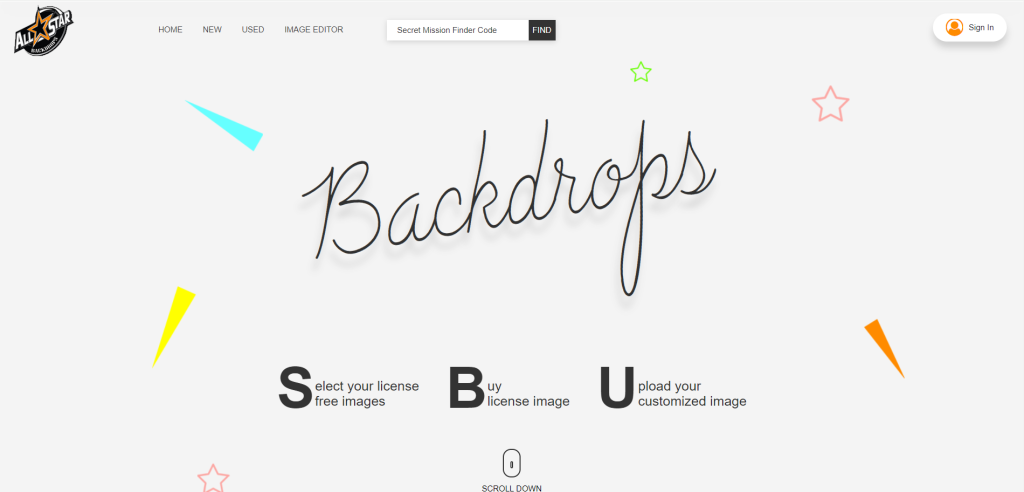
ASBD All Star Backdrop

Student Management System

E-Commerce Grocery Store

Investment Advisory Service

Taxi Booking App

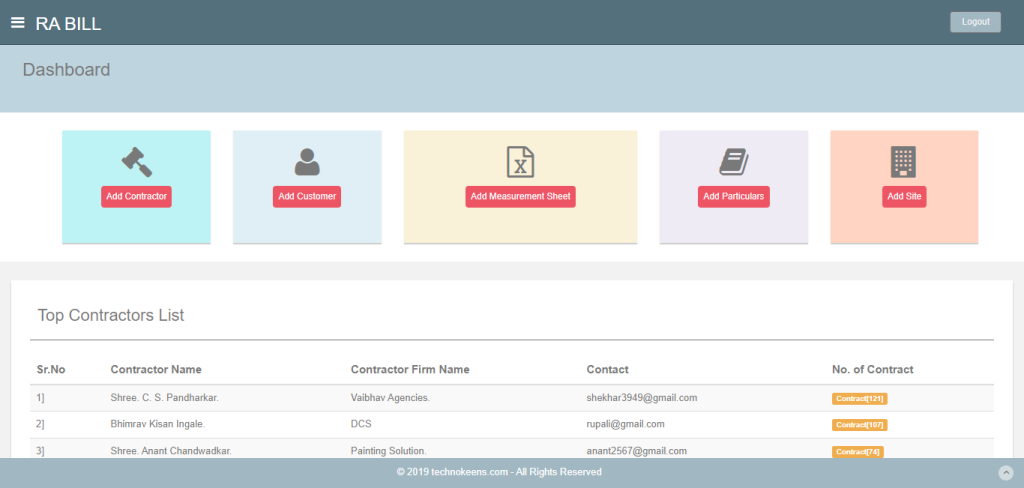
Estimate Generator And Management Portal
Government employees, specifically junior engineers, are responsible for creating and managing estimates in an Excel sheet. This process involves using specific formulas for calculations. However, due to the large amount of data and records, searching, deleting, and updating records is a lengthy and time-consuming task.
Student Management System